6.5 Create a histogram
A histogram uses the area of rectangular bars to display the frequency distribution (or relative frequency distribution) of a numerical variable.
We’ll use ggplot to create a histogram, and we’ll again use the penguins dataset.
We’ll give the code first, then explain below:
ggplot(data = penguins, aes(x = body_mass_g)) +
  geom_histogram(colour = "black", fill = "lightgrey") +
  xlab("Body mass (g)") +
  ylab("Frequency") +
  theme_bw()
## `stat_bin()` using `bins = 30`. Pick better value with `binwidth`.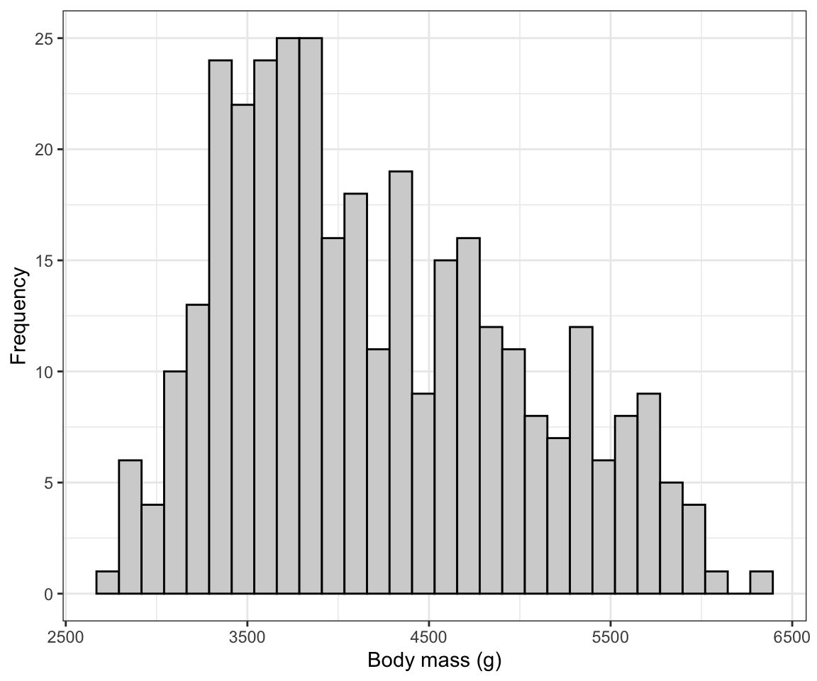
Figure 6.3: Histogram of body mass (g) for 342 penguins
The syntax follows what was seen above when creating a bar graph, but:
- Here we have only a single variable “x” variable,
body_mass_gto provide theaesfunction. - We use the
geom_histogramfunction, which has its own optional arguments:- the “color” we want the outlines of each bar in the histogram to be
- the “fill” colour we want the bars to be
You can also specify the “bin width” that geom_histogram uses when generating the histogram. Notice above that we got a message stating:
## `stat_bin()` using `bins = 30`. Pick better value with `binwidth`.It’s telling us that there’s probably a better bin width to use. The trick is to not have to small a bin width, such that you end up with too many bars in your histogram (giving too much detail in the frequency distribution), and to not have too large a bin width such that you have too few bars in your histogram (giving too little detail).
The hist function that comes with base R (so no need to load a package) has an algorithm that typically chooses good bin widths. To remove some of the subjectivity from this procedure, let’s leverage that function to figure out the best bin widths.
We’ll provide the code then explain after:
In the chunk above, we have:
- The “penguins.hist.info” is the name we’ll give to the object we’re going to create, and the assignment operator “<-” is telling R to put whatever the output from the function is into that new object
- The
histfunction takes the variable you want to generate a histogram function for. And in this case, it’s thebody_mass_gvariable in thepenguinstibble. - The dollar sign allows you to specify the tibble name along with the variable name: “penguins$body_mass_g”.
- The “plot = FALSE” tells the function we don’t wish to produce the actual histogram, and as a consequence the function instead gives us the information that would have gone into creating the histogram, including for example the break points for the histogram bins. It packages this information in the form of a “list”, which is one type of object.
Let’s look at the info stored in the list object:
## $breaks
## [1] 2500 3000 3500 4000 4500 5000 5500 6000 6500
##
## $counts
## [1] 11 67 92 57 54 33 26  2
##
## $density
## [1] 6.432749e-05 3.918129e-04 5.380117e-04 3.333333e-04 3.157895e-04
## [6] 1.929825e-04 1.520468e-04 1.169591e-05
##
## $mids
## [1] 2750 3250 3750 4250 4750 5250 5750 6250
##
## $xname
## [1] "penguins$body_mass_g"
##
## $equidist
## [1] TRUE
##
## attr(,"class")
## [1] "histogram"
We won’t worry about all the information provided here. Instead just notice that the first variable in the list is “breaks”. Specifically, this provides us all the “break points” for the histogram for the given variable; break points are the values that delimit the bins for the histogram bars.
That’s the information we can use to get the ideal bin width: the difference between consecutive breaks is our desired bin width!
In this example it’s easy to see that the bin width was 500. But lets provide code to calculate it and thus make sure it’s reproducible. We simply need to calculate the difference between any two consecutive break points (they will all be equal in magnitude):
## [1] 500The above code simply asks R to calculate the difference (using the subtraction sign) between the second element of the “breaks” variable, denoted using the square brackets “breaks[2]”, and the first element “breaks[2]”.
And R returns 500. That’s the bin width we want to use!
So let’s edit the original histogram code to include the “binwidth” argument in the geom_histogram function, as follows:
ggplot(data = penguins, aes(x = body_mass_g)) +
  geom_histogram(binwidth = 500, colour = "black", fill = "lightgrey") +
  xlab("Body mass (g)") +
  ylab("Frequency") +
  theme_bw()
Figure 6.4: Histogram of body mass (g) for 342 penguins
There we go! Now we need to learn how to describe and interpret a histogram…