8.4 Visualizing association between a numeric and a categorical variable
To visualize association between a numerical response variable and a categorical explanatory variable, we have a variety of options, and the choice depends in part on the sample sizes within the categories being visualized.
- When sample sizes are relatively small in each category, such as 20 or fewer, use a stripchart
- When sample sizes are larger (>20), use a violin plot, or less ideal, a boxplot.
We’ll use locust serotonin data set from the text book. Consult figure 2.1-2 in the text for a description.
Always remember to get an overview of the dataset before attempting to create graphs, and not only for establishing sample sizes. If you had gotten an overview of the locust dataset, you would see we have a numeric response variable “serotoninLevel”, but the categorical (explanatory) variable “treatmentTime” is actually coded as a numerical variable, with values of 0, 1, or 2 hours. Although this variable is coded as numeric, we can treat it as though it is an ordinal categorical variable.
We should re-code the “treatmentTime” variable in the locust dataset as a “factor” variable with three “levels”: 0, 1, 2. This is not necessary for our graphs to work, but it is good practice to do this when you encounter this situation where a variable that should be treated as an ordinal categorical variable is coded as numerical.
We do this using the as.factor function, as follows:
Before creating a stripchart, it’s a good idea to prepare a table of descriptive stats for your numerical response variable grouped by the categorical variable.
- Using what you learned in a previous tutorial, create a table of descriptive statistics of serotonin levels grouped by the treatment group variable.
8.4.1 Create a stripchart
Now we’re ready to create a stripchart of the locust experiment data. Note that we’re not yet ready to add “error bars” to our strip chart; that will come in a later tutorial.
We’ll provide the code, then explain after:
locust %>%
  ggplot(aes(x = treatmentTime, y = serotoninLevel)) +
  geom_jitter(colour = "black", size = 3, shape = 1, width = 0.1) +
  xlab("Treatment time (hours)") +
  ylab("Serotonin (pmoles)") +
  ylim(0, 25) +
  theme_bw()
Figure 8.6: Serotonin levels in the central nervous system of desert locusts that were experimentally crowded for 0 (control), 1, and 2 hours. N = 10 per treatment group.
- the
ggplotline of code is familiar - the new function here is the
geom_jitterfunction that simply plots the points in each group such that they are “jittered” or offset from one-another (to make them more visible). Its arguments include ‘colour = “black”’ telling R to use black points, “size = 3” to make the points a little larger than the default (1), “shape = 1” denoting hollow circles, and “width = 0.1” telling R to jitter the points a relatively small amount in the horizontal direction. Feel free to play with this arguments to get a feel for how they work. - the x- and y-axis labels come next
- then we specify the minimum and maximum limits to the y-axis using the
ylimfunction
Notice how all the data are visible! And it’s evident that in the control and 1-hour treatment groups the majority of locusts exhibited comparatively low levels of serotonin (note the clusters of points).
8.4.2 Create a violin plot
Given that violin plots are best suited to when one has larger sample sizes per group, we’ll go back to the penguins dataset for this, and evaluate how body mass of male penguins varies among species.
Let’s first find out more about the data for the male penguins, so that we can include sample sizes in our figure captions. Specifically, we’ll tally the number of complete body mass observations for each species, and also the number of missing values (NAs).
We’ll combine the filter function with the group_by function that we learned about in a previous tutorial:
penguins %>%
  filter(sex == "male") %>%
  group_by(species) %>%
  summarise(
    Count = n() - naniar::n_miss(body_mass_g),
    Count_NA = naniar::n_miss(body_mass_g))
## # A tibble: 3 × 3
## species Count Count_NA
## <fct> <int> <int>
## 1 Adelie 73 0
## 2 Chinstrap 34 0
## 3 Gentoo 61 0This is the same code we used previously for calculating descriptive statistics using a grouping variable (though we’ve eliminated some of the descriptive statistics here), but we inserted the filter function in the second line to make sure we’re only using the male penguin records.
We now have the accurate sample sizes for each species (under the “Count” variable) we need to report in any figure caption.
We use the familiar ggplot approach for creating violin plots.
When using the ggplot function, we can assign the output to an object. We can then subsequently add features to the plot by adding to the object. We’ll demonstrate this here.
Let’s assign the basic violin plot to an object called “bodymass.violin”, and we’ll explain the rest of the code after:
bodymass.violin <- penguins %>%
  filter(sex == "male") %>%
  ggplot(aes(x = species, y = body_mass_g)) +
  geom_violin() +
  xlab("Species") +
  ylab("Body mass (g)") +
theme_bw()- We assign the output to the object called “bodymass.violin”, and tell R which data object we’re using (penguins)
- We then
filterthe dataset to include only male penguins (sex == “male”), and note the two equal signs and the quotations around “male” - Then the familar
ggplotwith itsaesargument - Now the new
geom_violinfunction, and it has optional arguments that we haven’t used (see help file for the function) - Then the familiar labels and theme functions
Let’s now have a look at the graph, and to do so, we simply type the name of the graph object we created:
One problem with the above graph is that we don’t see the individual data points.
We can add those using the geom_jitter function we learned about when creating stripcharts.
Here’s how we add features to an existing ggplot graph object, and we can again create a new object, or simply replace the old one.
Here, we’ll create a new object called “bodymass.violin.points”:
And now show the plot:
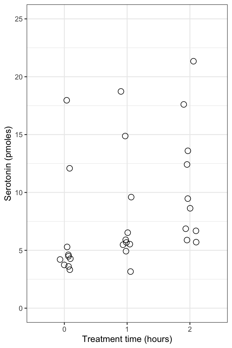
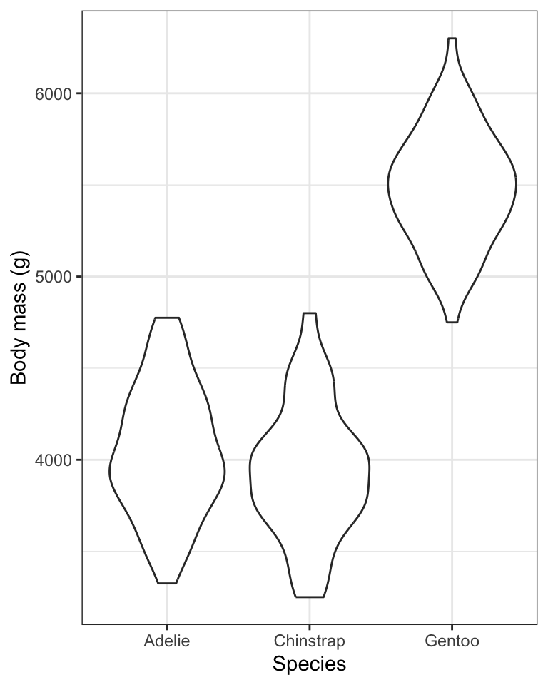
Figure 8.7: Violin plot showing the body mass (g) of male Adelie (N = 73), Chinstrap (N = 34), and Gentoo (N = 61) penguins.
TIP: If you wish to run all the code at once in a single chunk to create a figure, rather than adding new code to an existing object, here’s what you’d include in your chunk (but here we don’t show the chunk header that would include the caption):
penguins %>%
  filter(sex == "male") %>%
  ggplot(aes(x = species, y = body_mass_g)) +
  geom_violin() +
  geom_jitter(size = 2, shape = 1, width = 0.1) +
  xlab("Species") +
  ylab("Body mass (g)") +
  theme_bw()
To help understand what the violin plot is showing, we’ll provide a new bonus graph that adds something called “density plots” to the margin of the violin plot.
Don’t worry about replicating this type of graph, but if you can, fantastic!
First we create the main ggplot violin plot object:
bodymass.violin2 <- penguins %>%
  filter(sex == "male") %>%
  ggplot() +
  geom_violin(aes(x = species, y = body_mass_g, colour = species)) +
  geom_jitter(aes(x = species, y = body_mass_g, colour = species), size = 2, shape = 1, width = 0.1) +
  xlab("Species") +
  ylab("Body mass (g)") +
  ylim(3000, 6300) +
  theme_bw() +
  theme(legend.position = "bottom") +
  guides(colour = guide_legend(title="Species"))
Now we add density plots in the margins using the ggMarginal function from the ggExtra package:
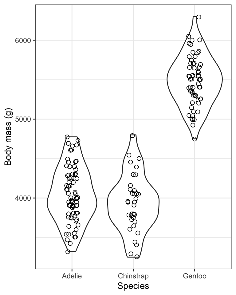
Figure 8.8: Violin plot showing the body mass (g) of male Adelie (N = 73), Chinstrap (N = 34), and Gentoo (N = 61) penguins. Density plots are provided in the margin.
The violin plot is designed to give an idea of the frequency distribution of response variable values within each group. Specifically, the width of the violin reflects the frequency of observations in that range of values. This is evident in the above figure within the “density plots” that are provided in the right-hand margin. Consider these density plots as a smoothed out version of a histogram.
We can see, for example, that for all three species of penguin there is a bulge in the middle indicating that there is a central mode to the body mass values in each group, with fewer values towards lower and higher extremes. The frequency distribution for the Gentoo species approximates a “bell shape” distribution, for example (the blue data).
8.4.3 Creating a boxplot
Here we’ll learn how to create basic boxplots, and also superimpose boxplots onto violin plots.
In future tutorials we’ll learn how to add features to these types of graphs in order to complement statistical comparisons of a numerical response variable among categories (groups) of a categorical explanatory variable.
Here is the code for creating boxplots, again using the penguins body mass data, and this time the geom_boxplot function:
penguins %>%
  filter(sex == "male") %>%
  ggplot(aes(x = species, y = body_mass_g)) +
  geom_boxplot() +
  xlab("Species") +
  ylab("Body mass (g)") +
  theme_bw()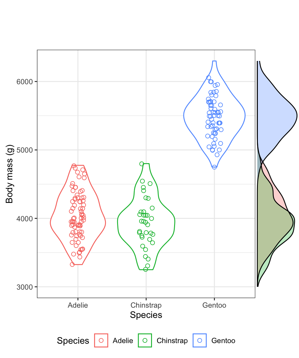
Figure 8.9: Boxplot showing the body mass (g) of male Adelie (N = 73), Chinstrap (N = 34), and Gentoo (N = 61) penguins. Density plots are provided in the margin. Boxes delimit the first and third quartiles, and the middle line depicts the median. Whiskers extend to values beyond the 1st (lower) and 3rd (upper) quartiles, up to a maximum of 1.5 x IQR, and individual black points are outlying values.
For more information about the features of the boxplot, look at the help file for the geom_boxplot function:
?geom_boxplotThe first time you include a boxplot in a report / lab, be sure to include in the figure caption the details of what is being shown. You only need to do this the first time. Subsequent boxplot figure captions can refer to the first one for details.
When sample sizes are large in each group, like they are for the penguins data we’ve been visualizing, the most ideal way to visualize the data is to combine violin and boxplots. We’ll do this next!
8.4.4 Combining violin and boxplots
Superimposing boxplots onto violin plots (and of course, showing individual points too!) provides for a very informative graph.
We already have a basic violin plot object created, called “bodymass.violin”, so let’s start with that, then add the boxplot information, then superimpose the points. We need to do it in that order, so that the points become the “top” layer of information, and aren’t hidden behind the boxplot or violins.
bodymass.violin +
  geom_boxplot(width = 0.1) +
  geom_jitter(colour = "grey", size = 1, shape = 1, width = 0.15)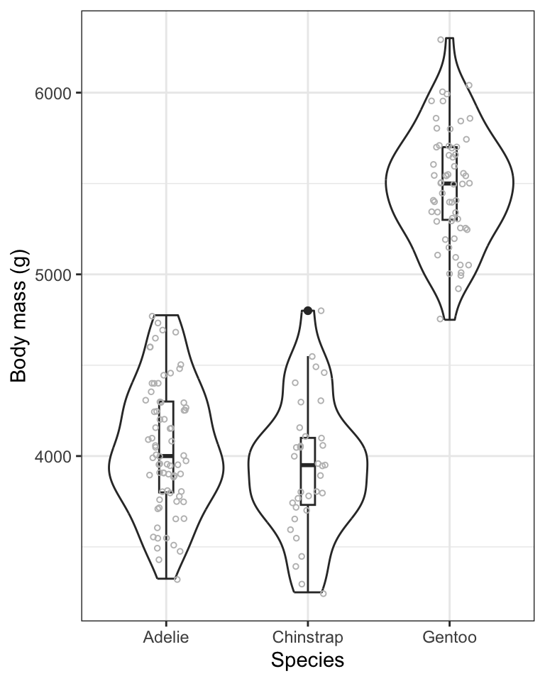
Figure 8.10: Violin plot showing the body mass (g) of male Adelie (N = 73), Chinstrap (N = 34), and Gentoo (N = 61) penguins. Boxplots are superimposed, with boxes delimiting the first and third quartiles, and middle line depicting the median. Whiskers extend to values beyond the 1st (lower) and 3rd (upper) quartiles, up to a maximum of 1.5 x IQR, and individual black points are outlying values.
- We start with the base violin plot object “bodymass.violin”
- We then add the boxplot using
geom_boxplot, ensuring that the boxes are narrow in width (width = 0.1) so they don’t overwhelm the violins - We then add the individual data points using
geom_jitter, and this time using the colour “grey” so that they don’t obscure the black boxes underneath, and making them a bit smaller this time (size = 1), and keeping them as hollow circles (shape = 1), and this time spreading them out horizontally a bit more (width = 0.15)
TIP: if you’d rather do all the code in one chunk, without creating objects, here’s what you’d include:
penguins %>%
  filter(sex == "male") %>%
  ggplot(aes(x = species, y = body_mass_g)) +
  geom_violin() +
  geom_boxplot(width = 0.1) +
  geom_jitter(colour = "grey", size = 1, shape = 1, width = 0.15) +
  xlab("Species") +
  ylab("Body mass (g)") +
  theme_bw()
It often takes some playing around with argument values before one gets the ideal graph. For example, in the above graph, try changing some of the values used in the geom_jitter function.
- Using the
penguinsdataset, and only the records pertaining to female penguins, create a combined violin / boxplot graph showing bill length in relation to species. Include an appropriate figure caption.
8.4.5 Interpreting stripcharts, violin plots and boxplots
In general, stripcharts, violin plots, and boxplots are used to visualize how a numeric variable varies or differs among categories (groups) of a categorical variable. For instance, it’s pretty obvious from the violin plots above that Gentoo penguins have, on average, considerably greater body mass than the other two species. We will wait until a future tutorial to learn more about interpreting violin / boxplots, because there we learn how to add more information to the graphs, such as group means and measures of uncertainty. For now, you should be comfortable interpreting any obvious patterns in the plots.