12.2 Fisher’s Exact Test
When testing for an association between two categorical variables, the most common test that is used is the \(\chi\)2 contingency test, which is described in the next section.
When the two categorical variables have exactly 2 categories each, and thus yield a 2 x 2 contingency table, the Fisher’s Exact test (a type of contingency test) provides an EXACT P-value, and is therefore preferred over the \(\chi\)2 contingency test (below) when you have a computer to do the calculations.
Often, and especially when the 2 x 2 contingency table deals with a health-related study, one refers to the Odds Ratio, which we’ll learn about below.
In any case, the most powerful statistical test for a 2 x 2 contingency analysis is a Fisher’s Exact test.
12.2.1 Hypothesis statement
We’ll use the cancer study data again for this example, as described in example 9.2 (Page 235) in the text.
The hypotheses for this test:
H0: There is no association between the use of aspirin and the probability of developing cancer.
HA: There is an association between the use of aspirin and the probability of developing cancer.
- We’ll use an \(\alpha\) level of 0.05.
- It is a two-tailed alternative hypothesis
- We’ll use a Fisher’s Exact test to test the null hypothesis, because this is the most powerful test when analyzing a 2 x 2 contingency table.
- There is no test statistic for the Fisher’s Exact test, and nor does it use “degrees of freedom” (the latter you’ll learn about soon, and is only required when we use a theoretical distribution for a test statistic)
HOWEVER: it is recommended that you report the “odds ratio” (which you’ll learn about below) in your concluding statement, along with its appropriate confidence interval; this is a useful stand-in test statistic for the Fisher’s Exact Test
- We also don’t need to worry about assumptions for this test, because it is not relying on a theoretical probability distribution
- It is always a good idea to present a figure to accompany your analysis; in the case of a Fisher’s Exact test, the figure heading will include information about the sample size / total number of observations, whereas the concluding statement typically does not
12.2.2 Display a contingency table
We’ll use the approach we learned in an earlier tutorial to construct a contingency table.
We’ll store the table in an object called “cancer.aspirin.table”, and we’ll make sure to include margin (row and column) totals:
cancer.aspirin.table <- cancer %>%
  tabyl(response, aspirinTreatment) %>%
  adorn_totals(where = c("row", "col"))
Let’s have a look at the result:
##   response Aspirin Placebo Total
##     Cancer    1438    1427  2865
##  No cancer   18496   18515 37011
##      Total   19934   19942 39876
When dealing with data from studies on human health (e.g. evaluating healthy versus sick subjects), it is convention to organize the contingency table as shown above, with (i) the outcome of interest (here, cancer) in the top row and the alternative outcome on the bottom row, and (ii) the treatment in the first column and placebo (control group) in the second column. When the data are not related to health outcomes, you do not need to worry about the ordering of the rows of data.
Let’s use the kable function to display a nice looking contingency table:
cancer.aspirin.table %>%
kable(caption = "Contingency table showing the incidence of cancer in relation to experimental treatments", booktabs = TRUE)| response | Aspirin | Placebo | Total |
|---|---|---|---|
| Cancer | 1438 | 1427 | 2865 |
| No cancer | 18496 | 18515 | 37011 |
| Total | 19934 | 19942 | 39876 |
12.2.3 Display a mosaic plot
Let’s visualize the data using a mosaic plot, taking note of the frequency of observations falling in each category (from the contingency table produced previously).
Here we’ll add a bit of new code to make the mosaic plot more ideally formatted. When we first learned how to create a mosaic plot, we saw that the y-axis was lacking tick-marks and numbers. We’ll remedy that here, using the scale_y_continuous, which allows us to specify what breaks (ticks) we want on the y-axis.
Here we’re showing “relative frequency” on the y-axis, so this should range from 0 to 1. And we’ll add breaks at intervals of 0.2. Specifically, we use the base seq function to generate a sequence of numbers from 0 to 1, in intervals of 0.2:
cancer %>%
    ggplot() +
    geom_mosaic(aes(x = product(aspirinTreatment), fill = response)) +
    scale_y_continuous(breaks = seq(0, 1, by = 0.2)) +
    xlab("Treatment group") +
    ylab("Relative frequency") +
    theme_bw()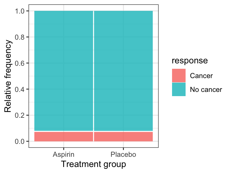
Figure 12.1: Relative frequency of cancer among women randomly assigned to control (n = 19942) and aspririn (n = 19934) treatment groups.
The mosaic plot shows that the incidence (or relative frequency) of cancer is almost identical in the treatment and control groups.
IMPORTANT It is best practice to display the response variable as the “fill” variable in a mosaic plot.
12.2.4 Conduct the Fisher’s Exact Test
To do the Fisher’s exact test on the cancer data, it is straightforward, using the fisher.test function from the janitor package.
There is also fisher.test function in the base R stats package, but it does not conform to tidyverse expectations. Hence our use of the fisher.test function from the janitor package. When there are multiple packages that use the same name for a function, we can specify the version we want by prefacing the function with the package name and two colons, like this: “janitor::fisher.test()”
See the help file for the janitor version of the fisher.test function:
?janitor::fisher.testThis function requires a two-way “tabyl” as the input, and we already know how to construct such a table.
We’ll put the results in an object called “cancer.fishertest”:
Let’s look at the results:
##
##  Fisher's Exact Test for Count Data
##
## data:  .
## p-value = 0.8311
## alternative hypothesis: true odds ratio is not equal to 1
## 95 percent confidence interval:
##  0.9342128 1.0892376
## sample estimates:
## odds ratio
##   1.008744
The P-value associated with the test is 0.831, which is clearly greater than our \(\alpha\) of 0.05. We therefore FAIL to reject the null hypothesis.
You’ll notice that the output includes the odds ratio and its 95% confidence interval. The interval it provides is slightly different from the one we’ll learn about below, but when reporting the results of a Fisher’s Exact test it is OK to report the confidence interval provided by the fisher.test function. It is also OK to provide the slightly different one that we learn about below.
Concluding statement
There is no evidence that the probability of developing cancer differs between the control group and the aspirin treatment group (Fisher’s Exact Test; P-value = 0.831; odds ratio = 1.01; 95% CI: 0.934 - 1.089).
TIP Report odds ratios to 2 decimal places, and associated measures of uncertainty to 3 decimal places