15.2 Checking the normality assumption
Statistical tests such as the one-sample t test assume that the response variable of interest is normally distributed in the population.
Many biological variables are known to be normally distributed in the population, but for some variables we can’t be sure. Given a proper random sample from the population, of sufficient sample size, we can assume that the frequency distribution of our sample data will, to reasonable degree, reflect the frequency distribution of the variable in the population.
Importantly, tests such as the one-sample t test are somewhat robust to minor violations of this assumption. Nevertheless, it is best practice to be transparent in testing the assumption, i.e. showing how it was tested and exactly what was found.
15.2.1 Normal quantile plots
The most straightforward way to check the normality assumption is to visualize the data using a normal quantile plot.
The ggplot2 package (loaded with the tidyverse package) has plotting functions for this, called stat_qq and stat_qq_line:
?stat_qq
?stat_qq_line
For details about what Normal Quantile Plots are, and how they’re constructed, consult this informative link.
If the frequency distribution were normally distributed, points would fall close to the straight line in the normal quantile plot.
Check out this example showing simulated data drawn from a normal distribution:
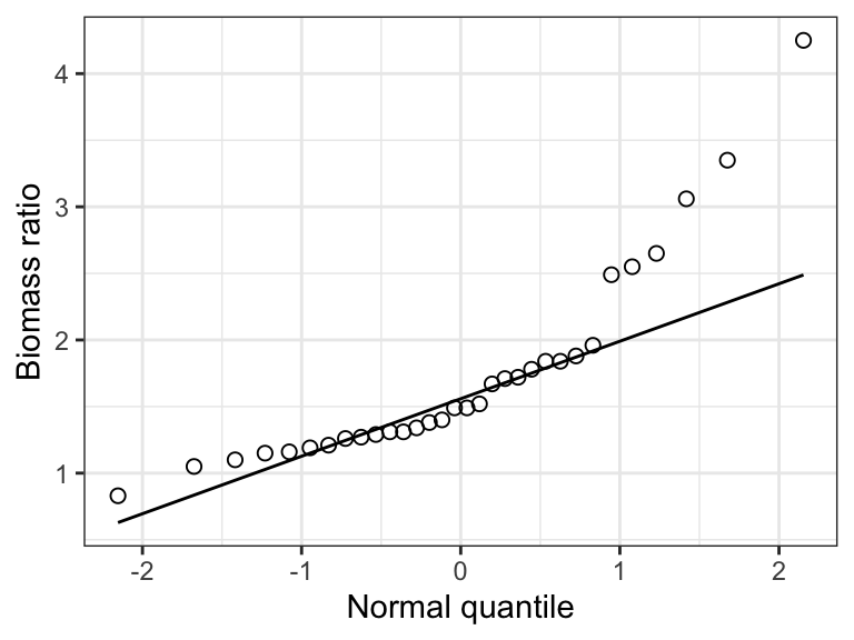
Figure 15.1: Example of a normal quantile plot for a variable that is normally distributed.
Now we’ll use the marine dataset and its variable called biomassRatio to illustrate.
We’ll first construct a histogram as you’ve learned previously, just to see how the shape of the frequency distribution relates to the pattern seen in the normal quantile plot.
marine %>%
  ggplot(aes(x = biomassRatio)) +
  geom_histogram(binwidth = 0.5, color = "black", fill = "lightgrey",
                 boundary = 0, closed = "left") +
  xlab("Biomass ratio") +
  ylab("Frequency") +
  theme_bw()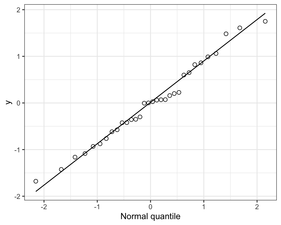
Figure 15.2: The frequency distribution of the ‘biomass ratio’ of 32 marine reserves.
Notice that the distribution is quite right-skewed (or “postively skewed”).
Now the quantile plot:
marine %>%
 ggplot(aes(sample = biomassRatio)) +
  stat_qq(shape = 1, size = 2) +
  stat_qq_line() +
  ylab("Biomass ratio") +
  xlab("Normal quantile") +
  theme_bw()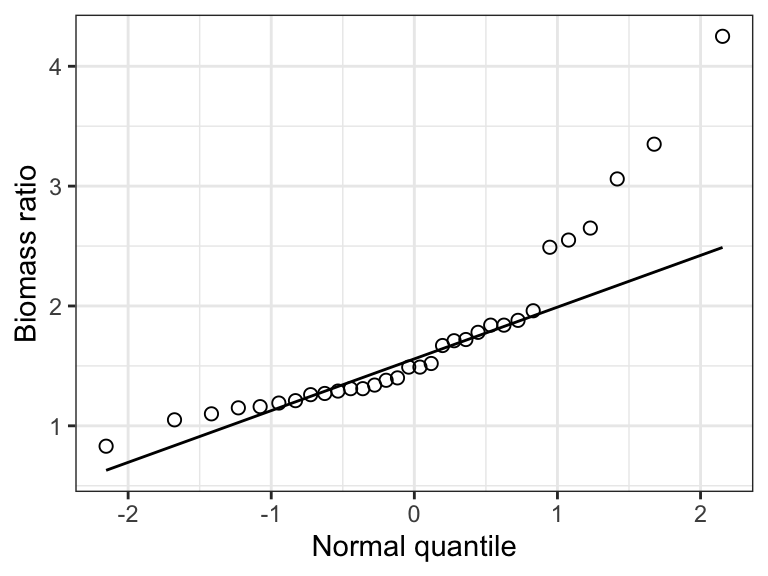
Figure 15.3: Normal quantile plot of the ‘biomass ratio’ of 32 marine reserves.
Notice that in the “aes” argument we use “sample = biomassRatio”. This is new, and is only required for the normal quantile plot, specifically the subsequent stat_qq and stat_qq_line functions.
Notice that normal quantile plot shows points deviating substantially from the straight line in the top-right part of the plot, and this corresponds to the right-skew in the histogram.
Clearly, the frequency distribution of the biomassRatio variable does not conform to a normal distribution.
Here’s an example statement one could make when checking this assumption:
The assumption of normality was checked visually using a normal quantile plot, which showed that the data were clearly not normally distributed.
Important: Egregious deviations from the normality assumption will be clearly evident in normal quantile plots (as in the example above). If it is difficult to tell whether the data are normally distributed, then they probably are OK (at least sufficiently with respect to the assumption).
15.2.2 Shapiro-Wilk test for normality
Although graphical assessments are usually sufficient for checking the normality assumption, one can conduct a formal statistical test of the null hypothesis that the data are sampled from a population having a normal distribution. The test is called the Shapiro-Wilk test.
The Shapiro-Wilk test is a type of goodness-of-fit test.
Sometimes the Shapiro-Wilk test is applied in a hypothesis testing framework, but when it is applied as part of checking assumptions for another statistical test (like we’re doing here), one does not need to present it in a hypothesis test framework. However, the implied null hypothesis is that “The data are sampled from a population having a normal distribution”, and one does interpret the resulting P-value in the same way as usual, i.e. in relation to an \(\alpha\) level (see below).
We’ll make use of the shapiro.test function from base R stats package:
shapiro.testLet’s use this on the biomassRatio variable in the “marine” dataset. We’ll assign the output to an object called “shapiro.result”, then we’ll have a look at the results.
The output from the shapiro.test function is not “tidy”, so we will use the tidy function from the broom package to make it tidy.
Here we go: we provide the function with the tibble name (“marine”) and the variable of interest after a “$”:
Now tidy the output:
Now look at the results:
## # A tibble: 1 × 3
##   statistic    p.value method
##       <dbl>      <dbl> <chr>
## 1    0.8175 0.00008851 Shapiro-Wilk normality test
The tidy object includes:
- The value of the test statistic for the Shapriro-Wilk test (although it is not shown, this test statistic is indicated with a “W”)
- The P-value associated with the test (“p.value”)
- The name of the test used (“method”)
Given that the P-value is less than a conventional \(\alpha\) level of 0.05, the test is telling us that the data do not conform to a normal distribution. Of course we already knew that from our visual assessments!
Here’s an example statement:
The assumption of normality was checked visually using a normal quantile plot, and a Shapiro-Wilk test, which revealed evidence of non-normality (Shapiro-Wilk test, W = 0.82, P-value < 0.001).
Important: Visual assessments of normality are preferred, because the outcome of the Shapiro-Wilk test is sensitive to sample size: a small sample size will often yield a false negative, whereas very large sample sizes could yield false positives more than it should.