9.4 Sampling distribution of the mean
Now let’s learn code to conduct our own resampling exercise.
Let’s repeat the sampling exercise we did in the preceding section concerning sampling error, but this time repeat it many times, say 10000 times.
We’ll also calculate the mean gene length for each sample that we take, and store this value.
For this, we’ll use the newly installed infer package, and its handy function rep_slice_sample, which complements the slice_sample function we’ve used before.
Let’s look at the code then explain after:
gene.means.n20 <- genelengths %>%
  rep_slice_sample(n = 20, replace = FALSE, reps = 10000) %>%
  summarise(
    mean_length = mean(size, na.rm = T),
    sampsize = as.factor(20)
  )
In the above chunk, we:
- Tell R to put the output from our functions into a new tibble object called “gene.means.n20”, with the “n20” on the end denoting the fact that we used a sample size of 20 for these samples
- use the
rep_slice_samplefunction to sample n = 20 rows at random from thegenelengthstibble, and repeat this “reps = 10000” times - next we use the familiar
summarisefunction to then create a new variable “mean_length”, which in the next line we define as the mean of the values in the “size” variable (and recall, at this point we have a sample of 20 of these) - we also create a new categorical (factor) variable “sampsize” that indicates what sample size we used for this exercise, and we store it as a factor rather than a number (we’re doing this because it will come in handy later)
Let’s look at the first handful of rows in the newly created tibble:
## # A tibble: 10,000 × 3
##    replicate mean_length sampsize
##        <int>       <dbl> <fct>
##  1         1       3094. 20
##  2         2       4705. 20
##  3         3       2576. 20
##  4         4       2957. 20
##  5         5       3060. 20
##  6         6       3768. 20
##  7         7       3412. 20
##  8         8       4258. 20
##  9         9       3242. 20
## 10        10       3134. 20
## # ℹ 9,990 more rows
We see that it is a tibble with 10000 rows and three columns: a variable called “replicate”, which holds the numbers one through the number of replicates run (here, 10000), a variable “mean_length” that we created, which holds the sample mean gene length for each of the replicate samples we took, and a variable “sampsize” that tells us the sample size used for each sample (here, 20).
Pause: If we were to plot a histogram of these 10000 sample means, what shape do you think it would have? And what value do you think it would be centred on?
9.4.1 Visualize the sampling distribution
Let’s plot a histogram of the 10000 means that we calculated.
First, to figure out what axis limits we should set for our histogram, let’s get an idea of what the mean gene length values look like:
| Name | Piped data |
| Number of rows | 10000 |
| Number of columns | 3 |
| _______________________ | |
| Column type frequency: | |
| numeric | 1 |
| ________________________ | |
| Group variables | None |
Variable type: numeric
| skim_variable | n_missing | complete_rate | mean | sd | p0 | p25 | p50 | p75 | p100 |
|---|---|---|---|---|---|---|---|---|---|
| mean_length | 0 | 1 | 3497.63 | 621.56 | 1650.2 | 3066.16 | 3439.65 | 3871.6 | 9609.4 |
OK, so we see that the minimum and maximum values are 1650.2 (under the “p0” heading) and 9609.4 (under the “p100” heading). So this can inform our x-axis limits when constructing the histogram (note that you typically need to try out different maximum values for the y-axis limits).
Let’s first remind ourselves what the true mean gene length is in the entire population of genes. We’ll assign the output to an object “true.mean.length” and a variable called “Pop_mean”, then show using the kable approach.
Show using kable:
| Pop_mean |
|---|
| 3511.457 |
Now let’s plot the histogram of 10000 sample means:
gene.means.n20 %>%
ggplot(aes(x = mean_length)) +
  geom_histogram(binwidth = 250, color = "black", fill = "lightgrey") +
  ylim(0, 1700) +
  xlim(1500, 10000) +
  xlab("Gene length (nucleotides)") +
  ylab("Number of genes") +
  theme_bw()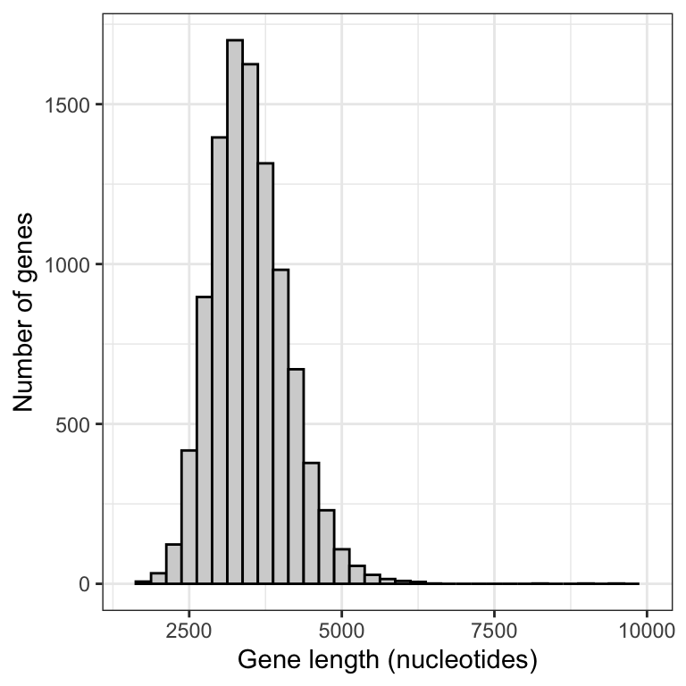
Figure 9.1: Approximate sampling distribution of mean gene lengths from the human genome (10000 replicate samples of size 20).
This histogram is an approximation of the sampling distribution of the mean for a sample size of 20 (to construct a real sampling distribution we’d need to take an infinite number of replicate samples).
Before interpreting the histogram, let’s first calculate the mean of the 10000 sample means, then display using the kable approach:
Show using kable:
| Sample_mean |
|---|
| 3497.633 |
Note that the mean of the sample means is around 3498, which is pretty darn close to the true population mean of 3511.
This reflects the fact that, provided a good random sample, the sample mean is an unbiased estimate of the true population mean.
Now, let’s interpret the histogram:
- The vast majority of means are centred around the true population mean (around 3500)
- The frequency distribution unimodal, but is right (positively) skewed; it has a handful of sample means that are very large
The latter characteristic reflects the fact that the population of genes includes more than 100 genes that are extremely large. When we take a random sample of 20 genes, it is possible that - just by chance - our sample could include one or more of the extremely large genes in the population, and this would of course inflate the magnitude of our mean gene length in the sample.
Let’s repeat this sampling exercize using a larger sample size, say 50.
gene.means.n50 <- genelengths %>%
  rep_slice_sample(n = 50, replace = FALSE, reps = 10000) %>%
  summarise(
    mean_length = mean(size, na.rm = T),
    sampsize = as.factor(50)
  )
Now plot a histogram, making sure to keep the x- and y-axis limits the same as we used above, so that we can compare the outputs
gene.means.n50 %>%
ggplot(aes(x = mean_length)) +
  geom_histogram(binwidth = 250, color = "black", fill = "lightgrey") +
  xlim(1500, 10000) +
  xlab("Gene length (nucleotides)") +
  ylab("Number of genes") +
  theme_bw()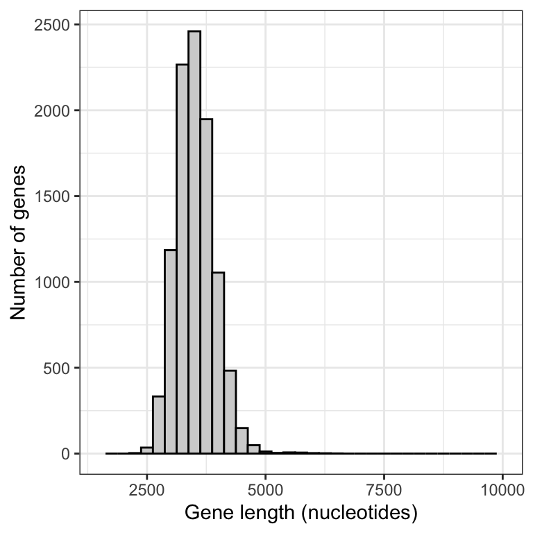
Figure 9.2: Approximate sampling distribution of mean gene lengths from the human genome (10000 replicate samples of size 50).
Notice that there is much less positive skew to this frequency distribution.
Let’s produce a figure that allows us to directly compare the two sampling distributions.
First we need to combine the data into one tibble.
New tool
We can merge two tibbles (or data frames) together by rows using the bind_rows function from the dplyr package
The bind_rows function will simply append one object to another by rows. This requires that the two (or more) objects each have the same variables. In our case, the two objects have the same three variables.
Now we have what we need to produce a graph that enables direct comparison of the two sampling distributions.
This type of graph is not something you’ll need to be able to do for assignments!
gene.means.combined %>%
 ggplot(aes(x = mean_length, fill = as.factor(sampsize))) +
  geom_histogram(position = 'identity', colour = "darkgrey", alpha = 0.5, binwidth = 250) +
  scale_fill_manual(values=c("#999999", "#E69F00")) +
  xlab("Gene length (nucleotides)") +
  ylab("Number of genes") +
  theme_bw() +
  theme(legend.position = "top") +
  guides(fill = guide_legend(title = "Sample size"))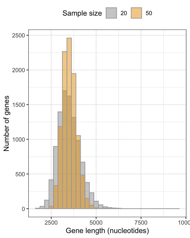
Figure 9.3: Approximate sampling distributions of mean gene lengths from the human genome, fig.height=, message=FALSE, warning=FALSE, using sample sizes of 20 and 50 (10000 replicate samples in each distribution).
We can see that the smaller sample size (20) yields a broader sampling distribution, and though it’s a difficult to see, it also exhibits a longer tail towards larger gene lengths.
With larger sample sizes, we’ll get more precise estimates of the true population mean!
- Follow this online tutorial that helps visualize the construction of a sampling distribution of the mean