6.4 Create a bar graph
We use a bar graph to visualize the frequency distribution for a single categorical variable.
We’ll use the ggplot approach with its geom_bar function to create a bar graph. The ggplot function comes with the ggplot2 package, which itself is loaded as part of the tidyverse.
To produce the bar graph, we use a frequency table as the input. Thus, let’s repeat the creation of the “tiger.table” from the preceding section, but this time we exclude the adorn_totals line of code, because we don’t want the “total” row to be plotted in the bar graph.
tiger.table <- tigerdeaths %>%
  count(activity, sort = TRUE) %>%
  mutate(relative_frequency = n / sum(n))
Recall that the “tiger.table” is a sort of summary presentation of the “activity” variable:
## # A tibble: 9 × 3
##   activity                  n relative_frequency
##   <chr>                 <int>              <dbl>
## 1 Grass/fodder             44            0.5
## 2 Forest products          11            0.125
## 3 Fishing                   8            0.09091
## 4 Herding                   7            0.07955
## 5 Disturbing tiger kill     5            0.05682
## 6 Fuelwood/timber           5            0.05682
## 7 Sleeping in house         3            0.03409
## 8 Walking                   3            0.03409
## 9 Toilet                    2            0.02273
It shows the total counts (frequencies) of individuals in each of the nine “activity” categories.
And although in the code chunk below you’ll see that we provide an “x” and a “y” variable for creating the graph, remember that we’re really only visualizing a single categorical variable.
Let’s provide the code first, and explain after.
ggplot(data = tiger.table, aes(x = reorder(activity, n), y = n)) +
  geom_bar(stat = "identity") +
  ylab("Frequency") +
  xlab("Activity") +
  coord_flip() +
  theme_bw()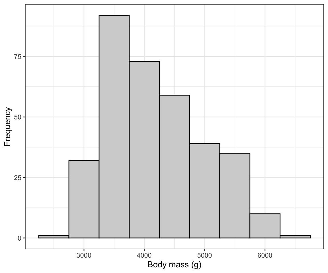
Figure 6.1: Bar graph showing the activities of 88 people at the time they were attached and killed by tigers near Chitwan national Park, Nepal, from 1979 to 2006
All figures produced using the ggplot2 package start with the ggplot function. Then the following arguments:
- The tibble (or dataframe) that holds the data (“data = tiger.table”)
- An “aes” argument (which stands for “aesthetics”), within which one specifies the variables to be plotted; here we’re plotting the frequencies from the “n” variable in the frequency table as the “y” variable, and the “activity” categorical variable as the “x” variable. To ensure the proper sorting of the bars, we use the
reorderfunction, telling R to reorder theactivitycategories according to the frequencies in thenvariable - Then there’s a plus sign (“+”) to tell the
ggplotfunction we’re not done yet with our graph - there are more lines of code coming (think of it as ggplot’s version of the “pipe”) - Then the type of graph, which uses a function starting with “geom”; here we want a bar graph, hence
geom_bar - The
geom_barfunction has its own argument: “stat = ‘identity’” tells it just to make the height of the bars equal to the values provided in the “y” variable, heren. - The
ylabfunction sets the y-axis label - The
xlabfunction sets the x-axis label - The
coord_flipfunction tells it to rotate the graph horizontally; this makes it easier to fit the activity labels on the graph - Then the
theme_bwfunction indicates we want a simple black-and-white theme
There you have it: a nicely formatted bar graph!
REMINDER Don’t forget to include a good figure caption! Here’s a snapshot of the full code chunk that produced the bar graph above:
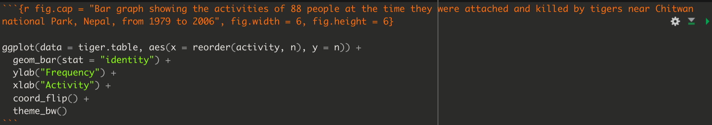
Figure 6.2: Example code chunk for producing a good bar graph
- Bar graph: Try creating a bar graph using the
birdsdataset, which includes data about four types of birds observed at a wetland.