6.4 Figures
When displaying data using a figure, follow these guidelines:
- The figure heading should be placed below the graph and should provide sufficient information so the figure can be interpreted on its own
- The heading can include statistical statements (Fig. 1) or simply describe what is being shown (Fig. 2)
- Sample size(s) must be reported
- The first time a particular type of graph is shown (e.g. boxplot), an explanation of the graph features must be provided. Subsequent figures of the same type can refer to the first for details. See Fig. 2 for an example
- Use hollow symbols so that overlapping points can be seen (Fig. 3)
- Orient all text horizontal (except y-axis label), including all tick labels
- Place axis tick marks outside of the figure border to avoid overlapping with observations
- Data points should not touch the axes
- Fitted lines (e.g. least-squares regression) included in figures should be fully explained in the heading,
- e.g. "Line represents a least-squares linear regression line, y = 0.3 + 4.5x (F = 5.65, df = 36; P = 0.021)".
- For more complex statistics (e.g. lines associated with mixed effects models) refer the reader to the text for details
- Bar plots should only be used to visualize categorical data (e.g. proportion of students with brown or blue eyes) or counts (number of flies on scat)
- When comparing numerical data among categories or groups (Figs. 1,2) use stripcharts (Fig. 1) when sample sizes are small (i.e. <20) and boxplots otherwise (Fig. 2).
- Note that the stripchart has the advantage of showing all the data (i.e. each observation is represented by a point), whereas the boxplot summarizes the data visually. When sample sizes per group are very large, it would get very messy if you tried to show all the data. However, there are graphs like "violin plots" that offer a nice compromise.
Examples
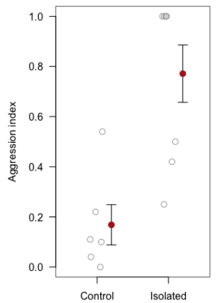
Figure 1. Aggression was significantly higher among isolated ants (n = 8) compared to the control group (n = 6) (see text for details). Shown are individual observations (grey circles), group means (solid circles) with +/- 1 SEM.
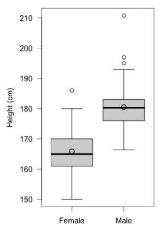
Figure 2. Height of male (n = 64) and female (n = 90) students within BIOL202. Thick horizontal lines represent group medians, large circles represent group means, boxes delimit 1st to 3rd quartiles, whiskers extend to 1.5 x IQR, and small circles represent extreme observations.
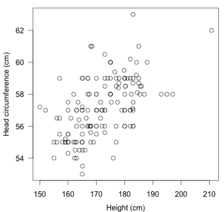
Figure 3. Head circumference versus height for n = 150 BIOL202 students. The positive association is highly significant (Pearson r = 0.82; P < 0.001).