16.7 Cusomizing Look and Feel
Many visual aspects of your graph can be customized. Most of these are controlled within themes.
Themes
There are many built in themes, for example, minimal. If you start to type theme_ RStudio will prompt you with a list of built in themes to choose from.
dotPlot +
  theme_minimal()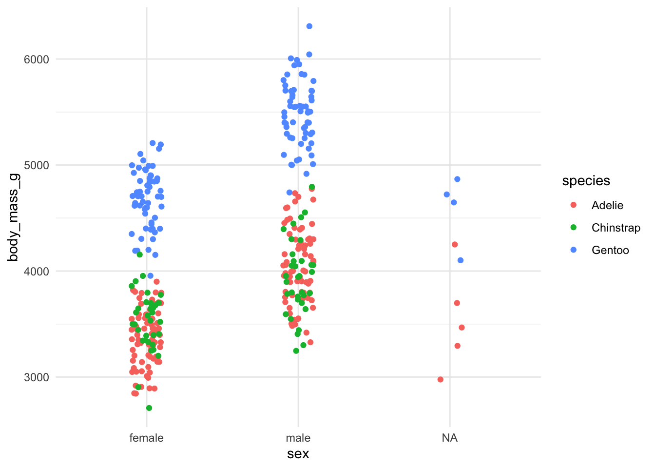
Within a theme, we can start to customize other elements. Things that we can customize included axes elements, legend elements, panel elements, and plot elements. For example, we can build on the theme minimal and remove the panel grids above, we do this with a separate, additional call to theme():
dotPlot +
  theme_minimal() +
  theme(
    panel.grid = element_blank()
  )
A full list of theme options are available on the ggplot theme reference page.
Colours
There are several ways of customizing the colours used in our plots, including using a custom colour palette.
It’s critical to remember to use appropriate combinations of colour depending on if your data is divergent, continuous, or qualitative in nature.
Examples of each of these include:
Sequential - for ordered data

Diverging - for data with a central location from which other values diverge

Qualitative- for categorical data with not natural order

Instead of having to generate your own custom colour palettes, a good alternative are the palettes produced by ColourBrewer that already have due consideration to things like contrast, colour blind audiences, benig print friendly etc.
Install
install.packages("RColourBrewer")Load
library(RColorBrewer)View the palettes available to us, noting it’s grouped by sequential, qualitative, and diverging palettes.
display.brewer.all()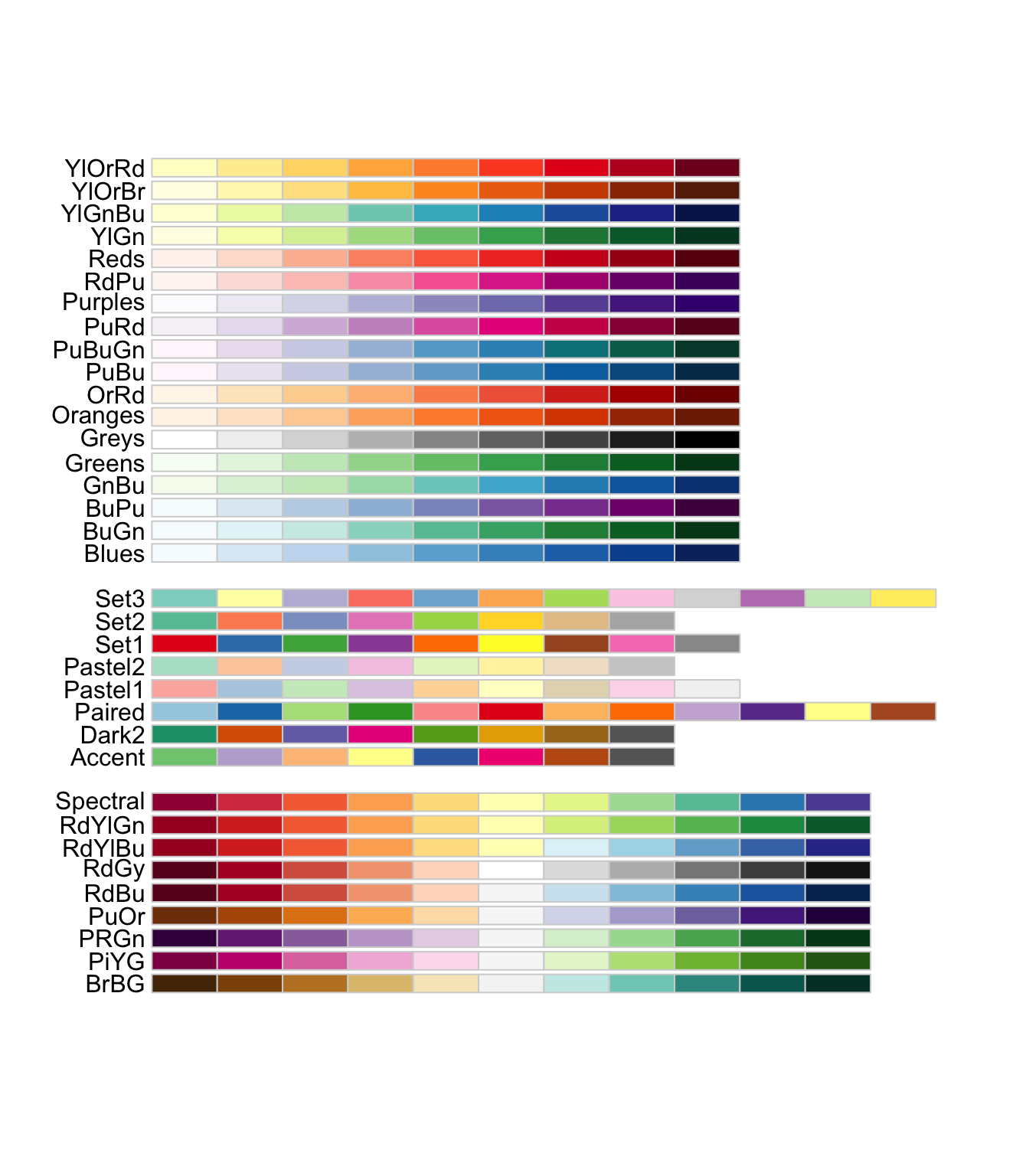
Use a palette, by making an additional call to either scale_color_brewer() or scale_fill_brewer() depending on you graph.
dotPlot +
  theme_minimal() +
  theme(
    panel.grid = element_blank()
  ) +
  scale_color_brewer(palette = "Dark2")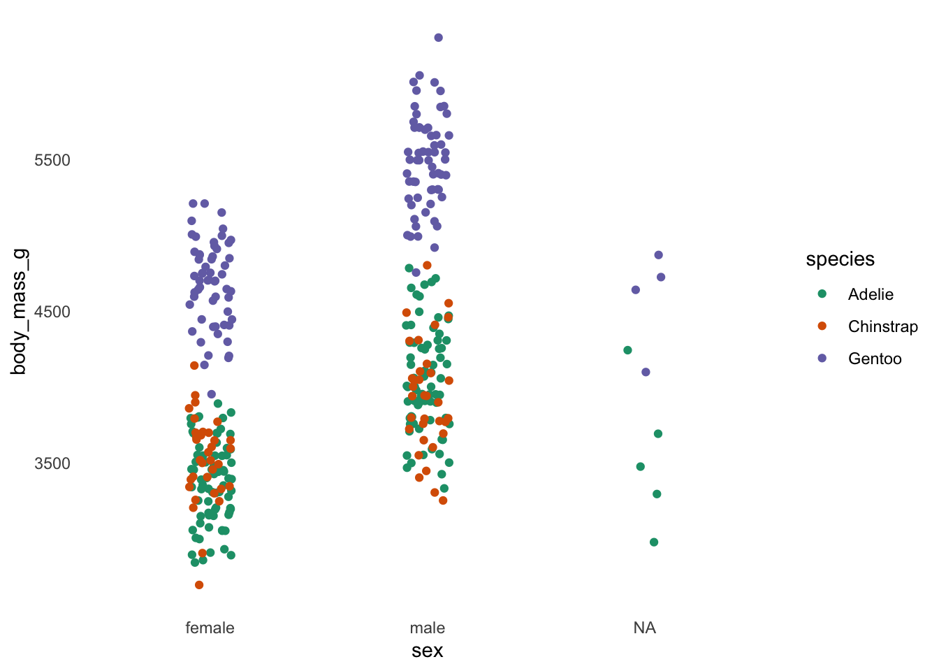
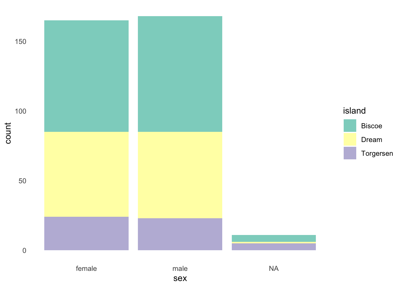
barGraph +
  theme_minimal() +
  theme(
    panel.grid = element_blank()
  ) +
  scale_fill_brewer(palette = "Set3")