Left Pane
On the left navigation you have four menu options: Welcome; Upload Data; Plot; Descriptive Stats; Analysis.
Upload Data
For now, ignore the option to upload your own data. Instead, use either the palmerpenguins data or the mtcars data, selected from the drop down menu in the Plot menu. In Lab 9, you'll upload your own data set from your experimental research project to build visualizations for your report.
Plot
Here we select the variables we'd like to visualize.
The shiny app currently does not include the option to visualize a single variable on its own. Rather, the app focuses on visualizing associations between two variables. If you’re curious about how to visualize a single variable (either categorical or quantitative), consult the relevant BIOL202 tutorial.
You'll want to first select a dataset, penguins or mtcars, and then select an x and a y variable from the drop down menus. Lastly, tell the Shiny App if your variable is quantitative or categorical. In Lab 2 we learned about each of these variable types, but here is a brief refresher:
Quantitative, or numeric, data may be either discrete or continuous.
- Discrete quantitative data are whole integers - population numbers are a good example of this, as we can't have half a person!
- Continuous quantitative data on the other hand are data that lies on a continuum - an example is temperature, where there are infinite potential temperatures between 25 and 26 degrees Celsius, but our data collection tool or convention determines to what decimal point we'll record a given temperature.
Categorical data, per its name, deals with categories of things and may be either nominal or ordinal.
- Ordinal categorical data has an intrinsic order where one thing is more or less than another - storm severity is often classified by stages - Stage 1, Stage 2 … Stage 5 - where Stage 1 is less severe than stage 5. We don't know how much more severe one stage is than the next - that is we can't quantify the difference - but we know there is an intrinsic order.
- Nominal categorical data has no natural order - the ordering of the colours blue, pink, or white makes no difference to the data or analysis.
Once you've selected your data sources and identified the data types you're working with, you'll be presented with a series of plotting options. You may also be presented with the option to group one of your variables. You will also be presented with the option to save a copy of your plot.
Plot Options
Here is a brief description of how to interpret the different plots created by the Shiny App.
Scatterplot
If you input a continuous numeric dependent variable with a continuous numeric independent variable, you will be presented with a scatterplot. An example of a scatterplot is shown below:
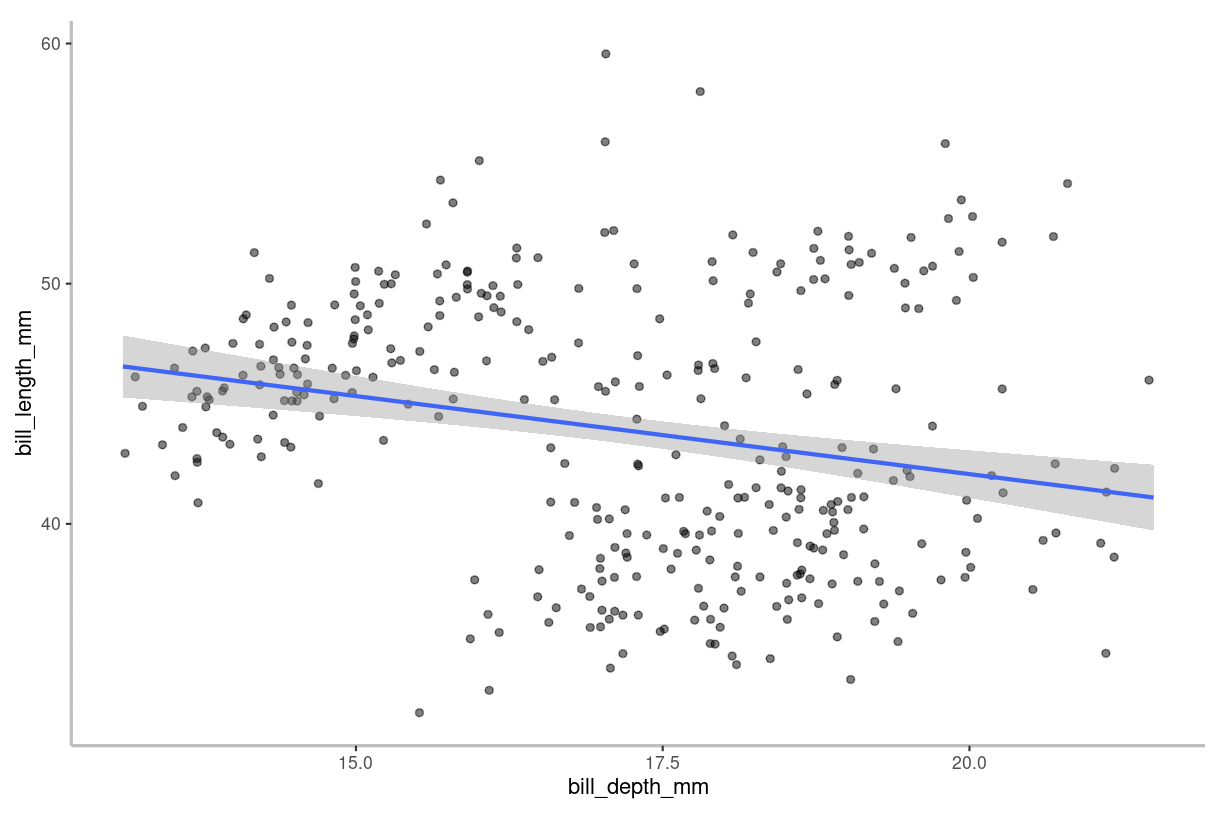
The blue line on the figure is the “line of best fit” aka a linear regression model. In other words, it is simply a straight line that represents the best approximation of the data points. This line helps you interpret the relationship between the variables. For example, the strength and direction of the relationship is described by the slope. The grey shaded region surrounding the line of best fit represents the 95% confidence interval for the model.
Stripchart & Boxplot
If you input a continuous numeric dependent variable with a categorical independent variable, you have the option to produce a stripchart or boxplot.
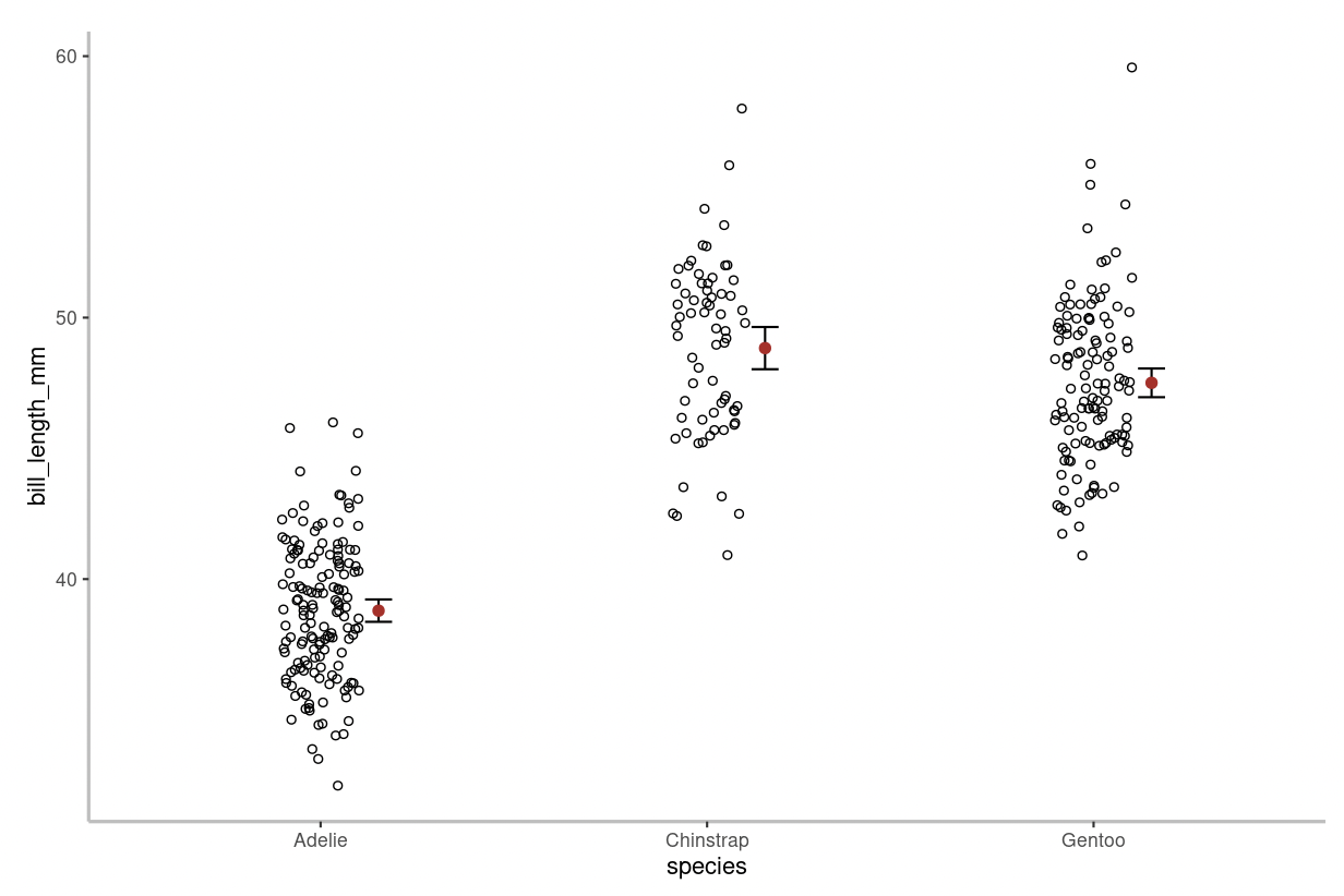
In a stripchart every data point is shown. On the figure above, individual data points are shown as hollow circles. The mean value is shown by the red circle and the 95% confidence intervals are displayed alongside the mean.
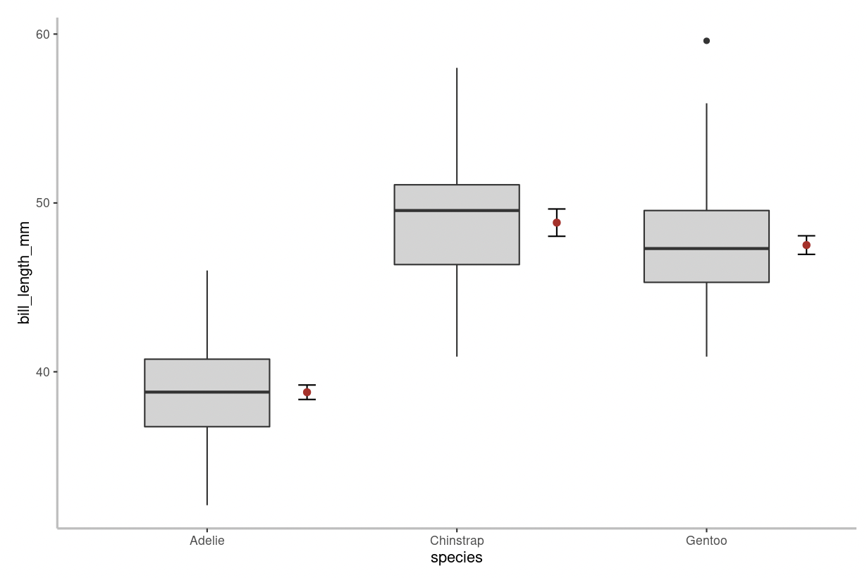
A boxplot differs from a stripchart in that it doesn’t show every data point. On the figure above, the thick horizontal lines represent group medians, boxes delimit 1st to 3rd quartiles, whiskers extend to 1.5 x the inter-quartile range, and small circles represent extreme observations (aka outliers).
Adjacent to the box and whiskers, the mean value is shown by the red circle and the 95% confidence intervals are displayed alongside the mean.
Mosaic Plot
If you input a categorical dependent variable with a categorical independent variable, you will be presented with a mosaic plot.
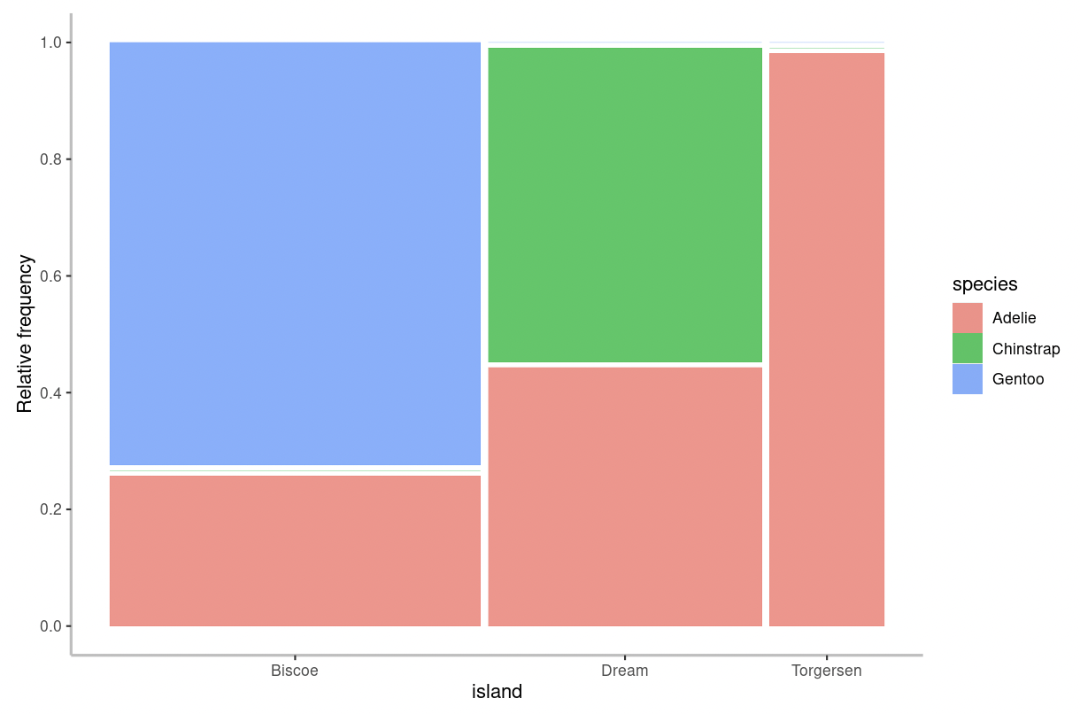
In a mosaic plot, the height of the bars describes the relative frequency for each category of the response variable (denoted by the “fill” colours) in relation to the categories of the explanatory variable (shown on the x-axis). The width of the bars are proportional to the sample size in each category of the explanatory variable.
Descriptive Stats
Here you can run basic descriptive stats on the data that you've plotted.
Similar to the instructions under the Plot tab, here, you must first select a dataset, penguins or mtcars, and then select two variables from the drop down menus, Variable 1 and Variable 2. Again, you'll need to tell the Shiny App whether each of these variables are quantitative or categorical.
Once you've made your selections, the Shiny App will automatically calculate the preferred descriptive statistics for the type of variables you have selected. For example, if you choose
- Two quantitative variables, the Shiny App will provide you with the sample size
n, mean, standard deviationsd, median, and inter-quartile rangeiqr. - Quantitative response (Y) variable and Categorical explanatory (X) variable, you will be provided with descriptive statistics for the quantitative variable, grouped according to the categories of the categorical variable. Specifically: the sample size
n(the number of observations belonging to each category), and the mean, standard deviationsd, and inter-quartile rangeiqrof the quantitative variable calculated for each category separately. - Two categorical variables, then a “contingency table” will be displayed, showing you how many observations fall into each combination of categories.
Analysis
Here is where you will perform statistical tests using your selected data. The type of test performed by the Shiny App depends on the type of variables you select.
\(t\)-test: This analysis is used when examining a single quantitative (numeric) response variable in relation to a single categorical variable that has only 2 groups or categories. Specifically, as described in a previous tutorial, it tests the null hypothesis that the mean of the numeric response variable does not differ between the two groups or categories of the explanatory variable.
- When performing a \(t\)-test in this app, you will be asked for a few additional parameters.
- Type in the significance level (\(\alpha\)) you would like to use for the \(t\)-test. For example, if you'd like a 5% significance level, type in 0.05.
- One assumption of the \(t\)-test is that the variance for each sample is approximately equal. However, the \(t\)-test used by this app (Welch's \(t\)-test) is somewhat robust to deviations in this assumption. For now, we will assume that both of your samples have equal variance. As such, please select 'Yes' when prompted for this option.
ANOVA: This analysis is used when examining a single quantitative (numeric) response variable in relation to a single categorical variable that has more than 2 groups or categories. Specifically, as described in a previous tutorial, it tests the null hypothesis that the mean of the numeric response variable does not differ between the groups or categories of the explanatory variable.
Fisher's Exact Test: This analysis is used when testing for an association between two categorical variables. It is only used when both categorical variables have exactly 2 groups or categories. For example, if one variable is sex (male/female) and the other is survival (yes/no). It tests the null hypothesis that there is no association between the two categorical variables.
\(\chi^2\) Contingency Analysis: This analysis is used when testing for an association between two categorical variables. It is only used when at least one of the categorical variables has more than 2 groups or categories. For example, if one variable is flower colour (red/white) and the other is season (spring/summer/fall). As explained in the “deeper dive” section of this tutorial, tests the null hypothesis that there is no association between the two categorical variables.
Once you've conducted a statistical test, the Shiny App will provide you with instructions for 'Interpreting the Output'. For this course, the main output of interest is the P-value. Recall from Lab 2 that if the P-value is less than our pre-defined significance level (\(\alpha\)), then we reject the null hypothesis in favour of the alternative. However, if the P-value is greater than the significance level, then we don’t reject the null hypothesis.